In today’s digital age, having a strong online presence is essential for businesses to thrive and stay competitive. One of the key elements that contribute to a successful online presence is responsive web design. In this blog post, we’ll delve into the importance of responsive web design and how it can benefit modern businesses.

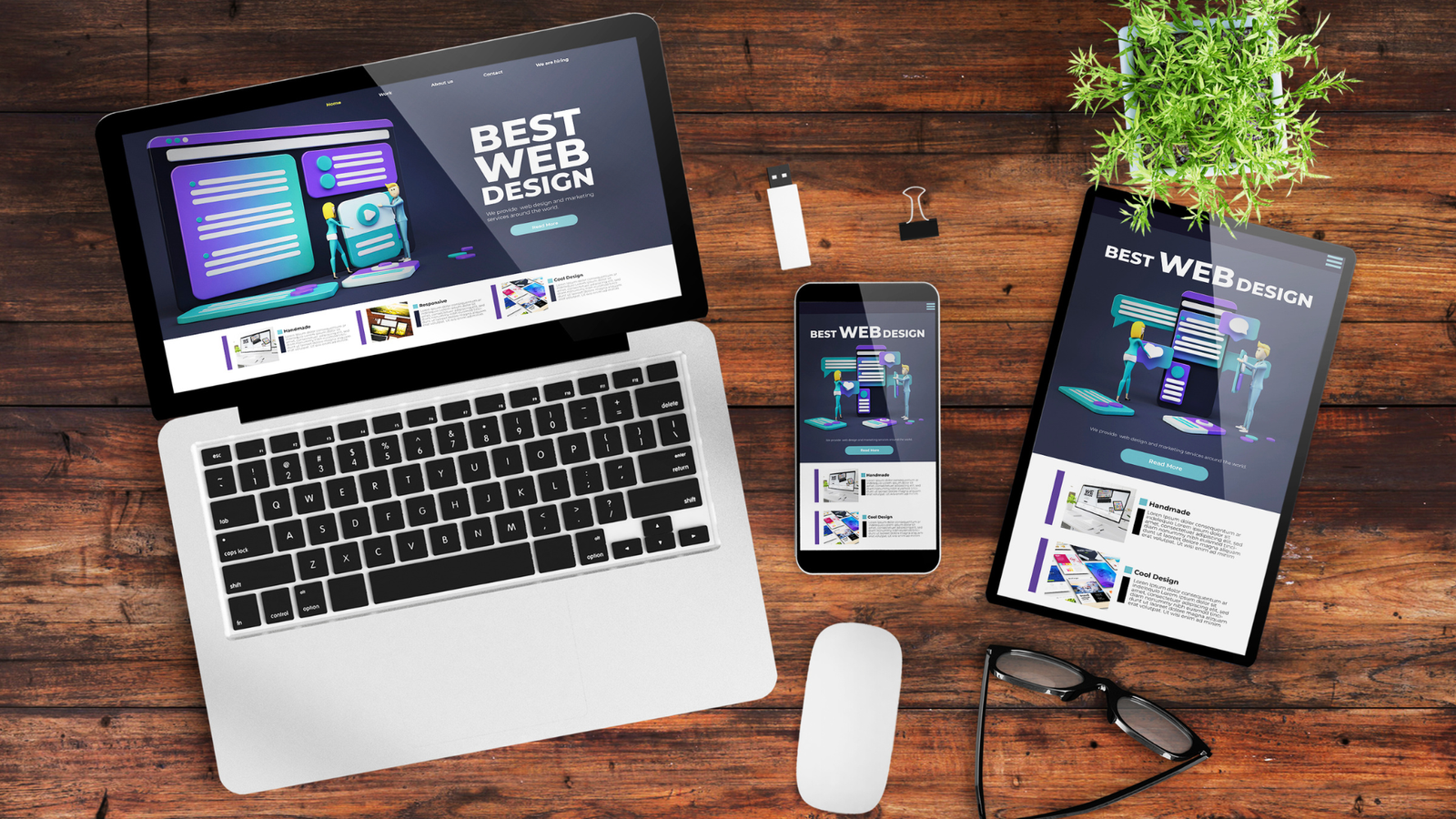
Why Responsive Web Design Matters
Responsive web design refers to designing and developing websites that adapt and display seamlessly across various devices and screen sizes, including desktops, laptops, tablets, and smartphones. Here are some compelling reasons why responsive web design matters in today’s digital landscape:
- Mobile Usage Trends: With the increasing use of mobile devices for internet browsing, having a mobile-friendly website is no longer optional. Responsive design ensures that your website looks and functions flawlessly on all devices, providing an optimal user experience.
- Improved User Experience: Responsive websites offer a consistent and user-friendly experience across different devices. Users can access your website conveniently, navigate through pages easily, and interact with content without any limitations.
- SEO Benefits: Search engines like Google prioritize mobile-friendly websites in search results. By implementing responsive design, you improve your website’s visibility and rankings, driving more organic traffic to your site.
- Cost-Effectiveness: Maintaining a single responsive website is more cost-effective than managing separate desktop and mobile versions. It reduces development time, maintenance efforts, and overall costs for your business.

Key Features of Responsive Web Design
Now, let’s explore some key features and best practices of responsive web design:
- Flexible Grid Layouts: Using flexible grid layouts based on percentages rather than fixed pixels ensures that content adjusts proportionally to different screen sizes.
- Media Queries: Employing CSS media queries allows you to apply specific styles based on device characteristics such as screen width, orientation, and resolution.
- Fluid Images and Videos: Ensuring that images and videos resize proportionally within their containers prevents distortion and enhances visual appeal across devices.
- Mobile-First Approach: Starting the design process with a mobile-first mindset ensures that your website is optimized for smaller screens and then progressively enhanced for larger devices.
Partner with br3ntw for Responsive Web Design Excellence
At BR3NTW.com, we specialize in creating responsive websites that not only meet but exceed user expectations. Our team of experienced web designers and developers follows industry best practices to deliver visually stunning and highly functional websites optimized for all devices.
Whether you’re a startup, small business, or enterprise in Charleston, WV, our responsive web design services can help you unlock new opportunities, reach a wider audience, and achieve your online goals. Contact us today to discuss your project, and let’s create a compelling online presence together!
Leave a Reply